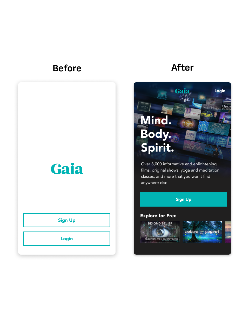
GAIA MOBILE APP ONBOARDING:
Converting app downloads into paying subscriptions
The Challenge
The product team at Gaia was given the mandate by our executive team to increase conversion rates as soon as possible—the next round of investor funding was particularly dependent on that metric.
I conducted a workshop with the mobile app team to determine what our team could do to have the most impact, while still being feasible enough to develop given our limited development resources and short timeline.
We determined that we could make the most significant changes to the pre-subscription experience:
Our current experience was almost non-existent (just a “sign up” CTA.)
The conversion funnel is at its widest at the start, giving us the most leverage to improve things.
Our developers could build a new experience without having to touch the most problematic pieces of code.
Our solutions
Through user interviews and testing, we identified the main areas for improvement.
Our value propositions. Most of our downloads came from Youtube and Facebook ads for related topics of interest that are covered by content on Gaia, but the subjects are so wide that many people were confused by what exactly Gaia was.
Content sampling. Our shows featured relative celebrities in their fields of interest, but the shows themselves had no notoriety. We had to give users a better idea of what our shows were actually like.
Clarify our plan comparison. Our plan display page was visually muddled and caused visible uncertainty in testing.
Confidence in checkout. Users showed hesitation when checking out due to a lack of visibility of their cart.
Value Propositions and Brand
Questionnaires and user interviews helped guide us to a set of short and meaningful value propositions to feature alongside the Sign Up CTA.
We had discovered that many app downloaders had merely seen a Youtube ad that appealed to their demographic without really informing them what Gaia actually was.
This also gave us the opportunity quickly convey our brand through a visual motif.
Content Exploration
We decided to introduce a limited content exploration experience, so that users could get a sense of our relatively unknown content.
By rotating the featured videos in “Explore for Free” frequently, we created a reason for people who were initially hesitant to subscribe, to return and convert on a longer timeline.
We also made the decision to default to dark mode for a more cinematic experience, as well as being better for eye-strain.
Plan Comparison
The previous grid of value propositions was difficult to read on mobile, so we prototyped a card layout that did much better in usability testing.
Cart Summary
We added a cart summary in response to feedback that users were uncertain that they were actually buying what they meant to.
This change implemented on its own resulted in a large improvement in conversion.


