GAIA TV APP REDESIGN:
Remaking a TV app experience
The Context
Our TV applications (AppleTV, Roku, LG and more) had varying levels of conformity and needed to be standardized. The development effort this would require justified a refresh of the entire design. By looking into our past user research, posting a new questionnaire, and holding an internal workshop, we identified the key aspects of the TV experience we wanted to upgrade.
The navigation placement at the top of the screen in place was cumbersome to use with a TV remote.
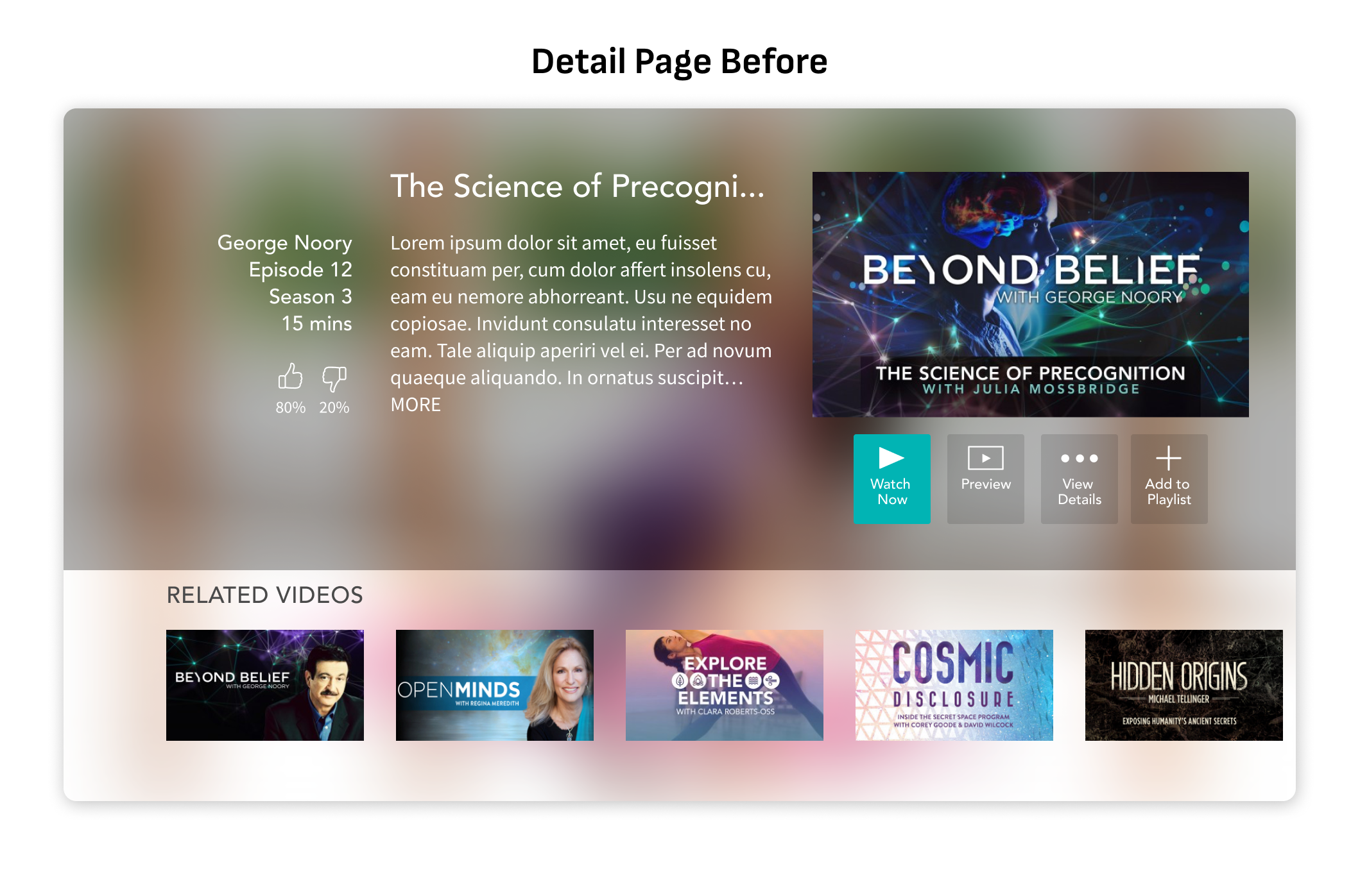
Our detail pages lacked descriptions and were uninspiring to look at.
The light background was hard on the eyes for prolonged browsing.
The overall experience felt clunky.
The Solutions
After several white boarding sessions and extensive competitive research, the design team settled on a few concepts to implement and test.
Use a side navigation scheme to reduce the number of clicks needed using a TV remote to browse.
Detail pages for series content that provides full descriptions and thumbnails for individual episodes.
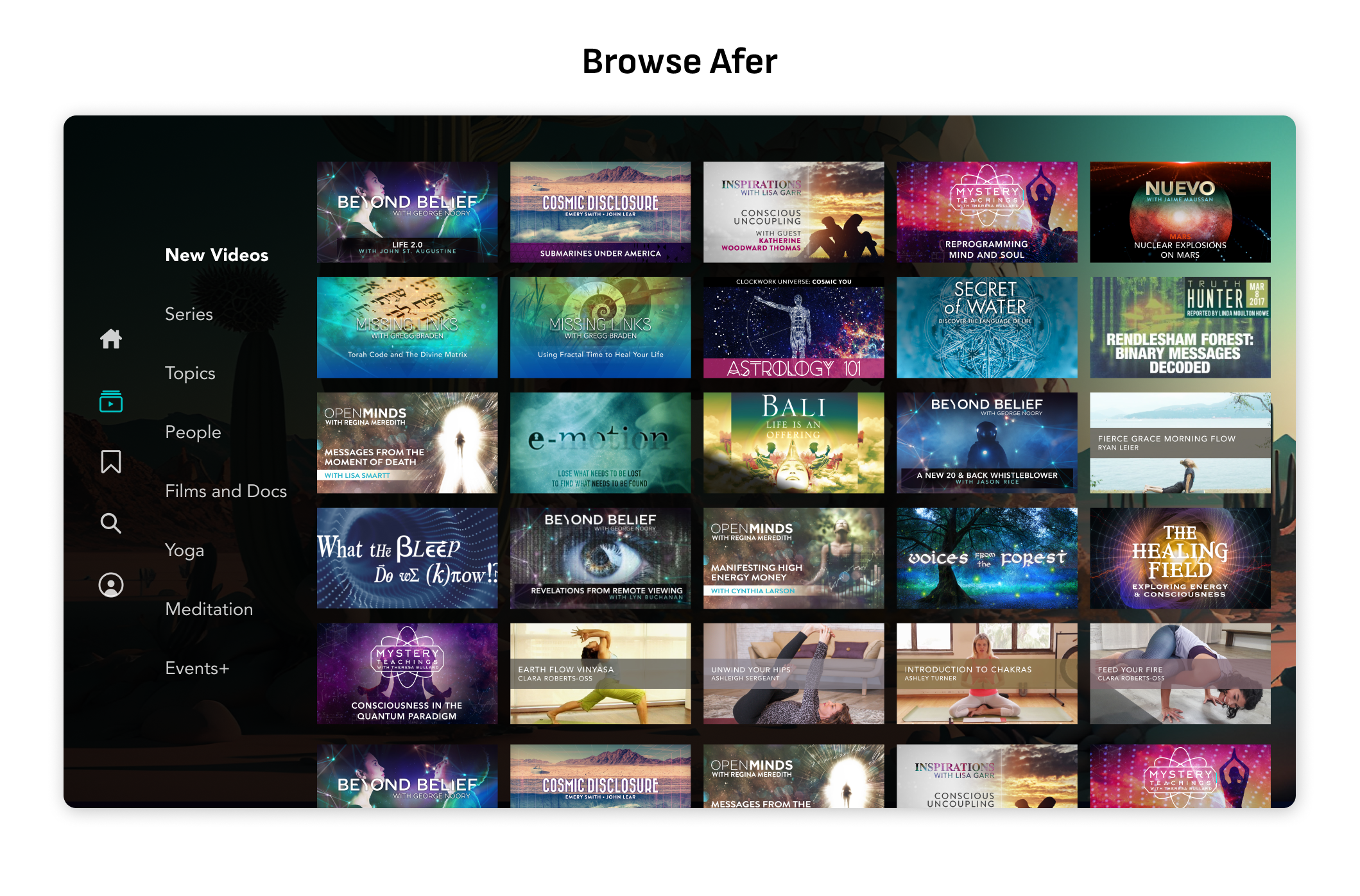
Use a dark theme for the UI to reduce eye strain.
Navigation
By moving the navigation from the top of the screen to the side, we made it more accessible for users who were many rows deep into browsing.
It also allowed us to expand the aspect ratio of the header, allowing autoplaying video previews and a more cinematic presentation.
Video Detail
I decided to move all interactions over to the left side of the screen where the eye more naturally leads from the relocated side navigation.
This also allowed so much more room behind the description that we could feature stills from the episode itself, as well as autoplaying the selected video on some platforms.
Episode List
Where they were previously separated, we decided to combine our video detail page and the episode list page to reduce click fatigue and preserve context for browsing through multiple episodes of a series.
Browsing
We decided to take out the extra category icons, and relocate everything to the side navigation.
By maintaining all navigation on the left side, fewer clicks are necessary, especially on a long browse.
This pattern repeats on the search and account pages, and this consistency was noted in our user research.
Usability Testing and Validation
We built a prototype in the testing environment of our Roku app, and conducted usability testing with coworkers in the office. We gave them a task completion survey to arrive at much improved usability score.
Once we deployed to our test environment with a limited percentage of our user base, there was a significant uptick in the amount of minutes watched per user as well as the number of key interactions (playlist adds, series followed, etc.)


